8 Lab 8: Making Maps - Part II
In this lab we will continue working on our map of the Bamburgh Castle region, this time focusing on manually digitizing polygons, labelling, and finishing our actual map page layout.
To complete this lab, you must watch the practical videos on how to manually digitise features in QGIS, which are available on the Week 4 prep page on Canvas
8.1 Getting Ready
Make sure you restore the project folder and files you created in the previous lab, and then open your project.
8.2 Guided Exercise 1 - Digitizing the castle
One thing that seems to be missing from our map is more emphasis on the castle’s location. Let us use the aerial photo we acquired to digitize the castle area.
- Add to your project the aerial orthophoto you downloaded at the start of the previous lab. If you had a wide selection and downloaded multiple tiles, the correct file is
nu1835_rgb_250_03.jpg. It may be that the photo comes without a CRS defined (a question mark icon will appear to the right of the layer name). If that happens, just right click on the layer name, and selectLayer CRS > Set Layer CRSto pick EPSG:27700.
Why did we use Set Layer CRS and not Reproject?
- Now we need a new empty layer to digitise on. Click on the
New shapefile layerbutton ( ) on the main QGIS toolbar. You will get the
 New Shapefile Layerwindow:
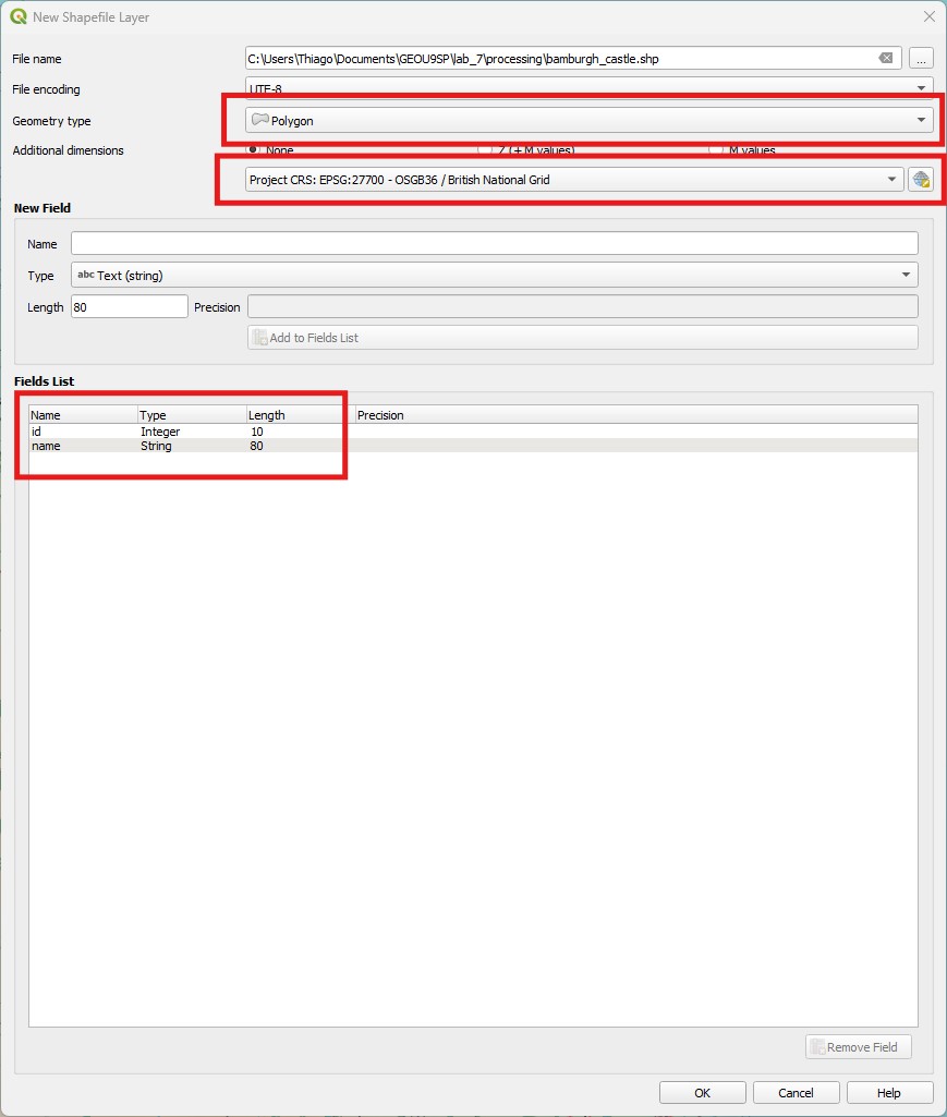
First pick a folder to save your file and name it
bamburgh_castle, on theFile Namebox. Then forGeometry type, pickPolygon, and pick EPSG:27700 for the CRS. Notice how QGIS automatically creates an integer attribute namedid. We want a text attribute to hold the castle name, though, so enternameas the name of the field on theNew Fieldoptions, then pick theText (string)data type and a length of80(the default) and click onAdd to Fields List. You should see the newnamefield added to the fields list. Then clickOK.Find your new layer on the
Layer Panel. It doesn’t have any geometries yet, so you won’t see anything on your map. Highlight your new layer, and then put it into editing mode by clicking on theToggle Editingbutton ( ) on the main QGIS toolbar. Make sure you are editing the right layer (it should have a pencil symbol on top of the symbology colour on the layer list).
Now right-click on the aerial photo layer and select
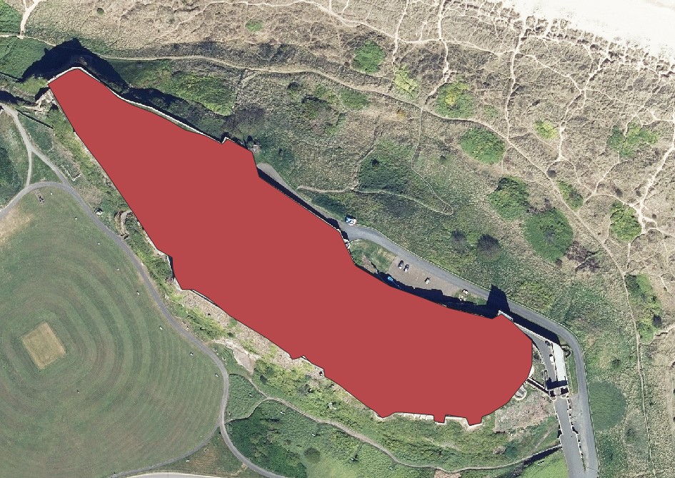
Zoom to Layer(s)to centre the map canvas on it. Then manually set a scale of 1:1500 on the bottom QGIS bar. It is important to be aware of the scale you are digitizing at, and keep it constant so that the level of detail is also constant. Drag the castle to the middle of the canvas using thePan Maptool (the hand).Now highlight the new shapefile layer (which is being edited) again. The
Digitizing toolstoolbar ( ) should be available. Click on the
 Add Polygon Featurebutton ( ) to enter a polygon drawing mode. Start clicking anywhere in the castle outer walls, and then keep clicking to trace the entire castle shape. Once you finish you polygon, right-click to end the drawing. A window will pop-up asking you to enter an
 idandname. Enter1andBamburgh Castlerespectively.If you want to edit the polygon shape after the fact, use the
Vertex Tool( ). Then click once on a vertex to select it, and then cick again to reposition it, or the Delete key on your keyboard to delete it. You can also add a new vertex by hovering the mouse in between vertices until you see a red
 x. You should end up with something like this:
- Once you’re happy with your polygon, remember to click the
Save Layer Editsbutton (on the editing toolbar - not theSave projectbutton) and then exit editing mode. Set you map back to the 1:80000 scale you decided on in the previous lab, and pick a strong and visible colour for the castle polygon. Turn off the aerial image again, and save your project.
8.3 Guided Exercise 2 - Adding places and labels
No good map is complete without the addition of informative labels, which help add context and reference. QGIS has very powerful labelling features (which we will only lightly explore), but you should always spend some good effort on labelling - it often turns a good map into a great map.
When should I use labels and when should I use the map legend to name things?
- Right click on the castle layer you created and go to
Properties > Labels. Change theNo Labelsbox toSingle Labels, to reveal several options. ForValue, pick thenameattribute, which contains our layer name. On theTextsub-tab, increase the font size to14, and on theBuffersub-tab, click onDraw Text Buffer. Click onApply, and you should get a label like in the figure below:
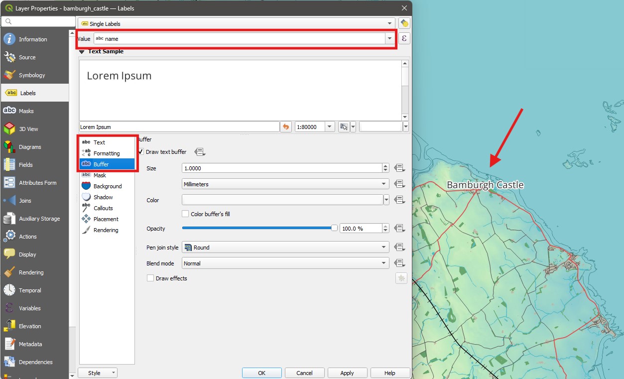
- The label is however hiding the actual castle polygon. So return to
Properties > Labelsand go to thePlacementsub-tab, change theModetoOutside Polygons, and setDistanceto 1 millimetre. The label should move to the right of the polygon now.
Next, let us add some named places to the map, to help with navigation. For that we will use another layer from the Vector Map District OS database we downloaded, the NU_Named_Place layer.
- Add the
NU_NamedPlace.shplayer to your project. You will see a large number of points appear, probably too many to look good. But this dataset has information on the type of place (CLASSIFICA) and an indication of place importance (FONTHEIGHT), that we could use to reduce the number of points.
How would you reduce the number of points show based on the above attributes?
Why do the attributes have truncated names such as
CLASSIFICA?
If we want to limit the number of features that are available to us in a layer, we can use the Filter method instead ofSelect by Expression. While selecting is useful to create a selection that you can then export or summarise, filtering will essentially hide the information from view and manipulation - as if it didn’t exist. Let us filter our named places to only medium and large populated places.
- Right click on the
NU_namedPlace layerand selectFilter.... You will see a new window similar to theSelect by Expressionwindow. On this window, you can pick attributes on the top left, and then list all unique values of each attribute in the top right (select the attribute then click onAll). You can then double click on attribute names, values and operators, or simply type your expression in the bottom window. For this dataset, we want to filter using the following expression:"CLASSIFICA" = 'Populated Place' AND ("FONTHEIGHT" = 'Medium' OR "FONTHEIGHT" = 'Large'). Notice the parentheses! Then click onOK.
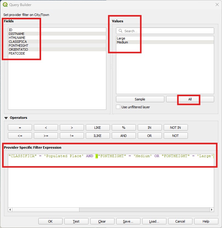
Why do we use a set of parentheses to encapsulate the OR statement in the expression above?
You should now have a lot fewer Named Places scattered through the map, and if you inspect the attribute table, you will see only the filtered results. It is as if the rest of the data doesn’t exist! You will always know if a layer is being filtered by the ‘funnel’ symbol to the right of the layer name (and you can click on the symbol to edit or clear the filter).
Now follow the same procedure you used to label Bamburgh Castle to label the populated places, using the
DISTNAMEattribute - but use a font size of10to keep the visual hierarchy in relation to the castle, and keep thePlacementoption as the defaultCartographicoption.Change the
Symbologyof theNU_NamedPlaceslayer to the preset symboltopo pop capital(a white circle with a black dot in the middle), with aSizeof2.4.Add the
NU_RailwayStation.shpfile to your map, and label it using theDISTNAMEattribute as well (you should see only one station, ‘Chathill’). Make the label size10, colour itblueand make its stylebold italic; do not use abufferthis time.Now go to the
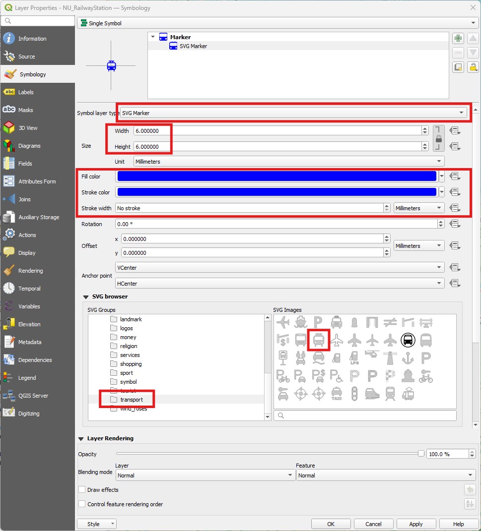
Symbologytab for the railway station layer, and pickSingle Symbol. Select theSimple Markersub-item, and then change theSymbol layer typefromSimple MarkertoSVG Marker. SVG stands for ‘Scalable Vector Graphics’ and is a commonly used format to store figures in desktop publishing.Once you change the
Symbol layer type, a newSVG Browsersection will appear below. In there, find thetransportfolder on the browser to the left, and pick the railway symbol (looks like a train). Then above it, change theFill Colorto the same blue you used for the label, and decrease theStroke Widthuntil it saysNo stroke. Increase the size of the symbol to6(width and height should be linked by default). Your options should look like this (stroke colourdoesn’t matter):
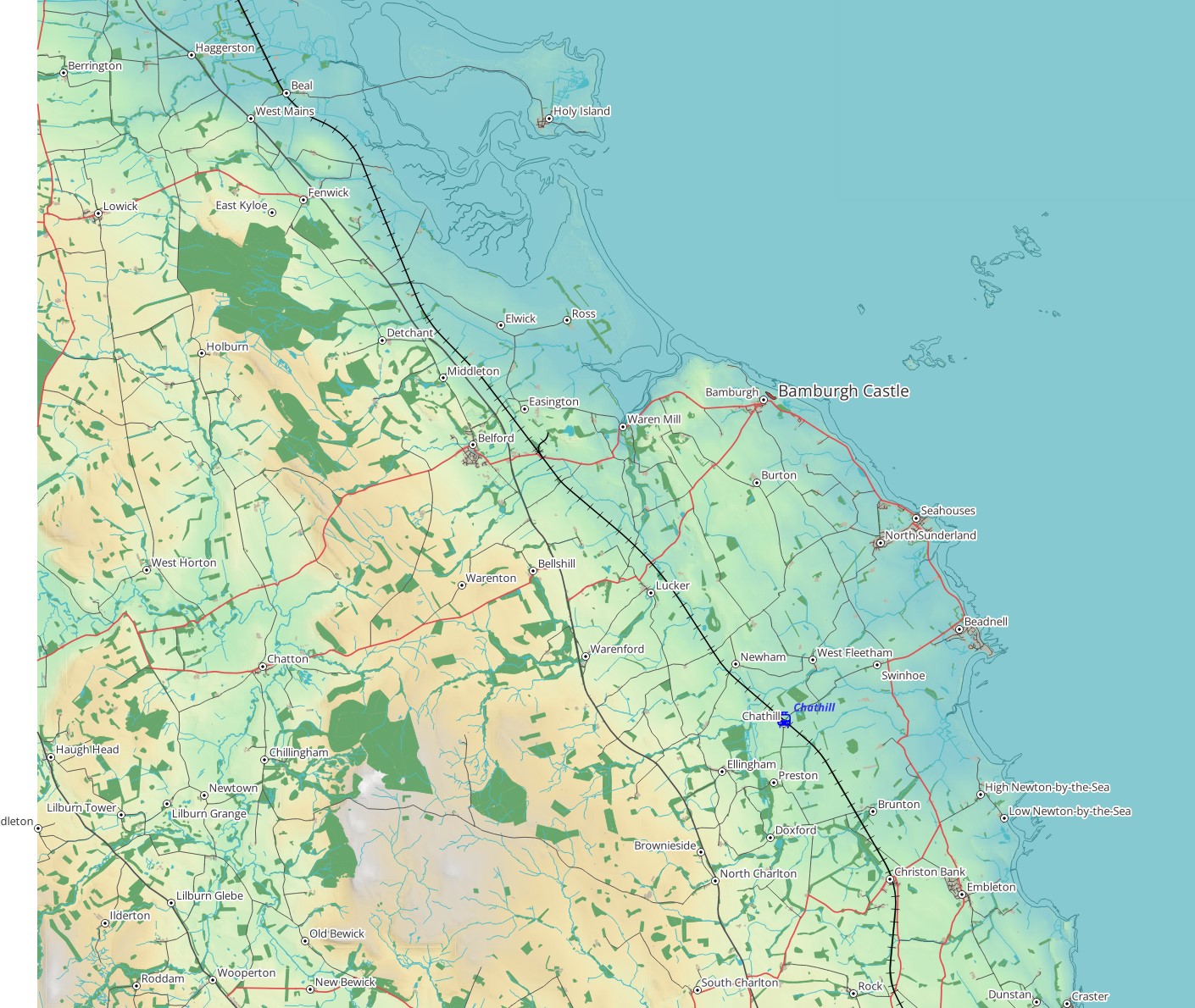
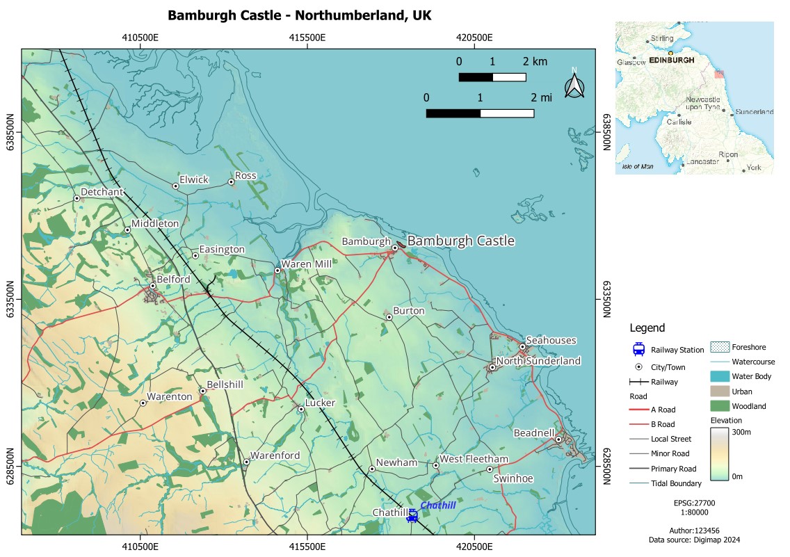
Good job with labelling! Your map should now be looking like this:
- Save your project.
8.4 Guided Exercise 3 - Laying out the final map
We have now added everything we want to our map, and styled and labelled it properly. Now it is time to work on the final page layout for our map. This is where we add the critical cartographic elements that turn a figure into a map (legend, scale, graticule, north arrow), and include some map insets and annotations to facilitate map interpretation.
8.4.1 The Legend
The map legend is the most important cartographic element, as it associates meaning to all the visual variables (colours, symbols, sizes, patterns) you have used on your map. QGIS has a handy tool to generate the legend automatically, but we should always tweak the end results to improve map readability.
Go to the menu
Project > Layoutsand pick the layout you created in the previous lab, when you were deciding on the scale and coverage of your map. TheLayout editorwindow will launch separately from the main QGIS window.Either go to the menu
Add Item > Add Legendor click theAdd Legendbutton ( ) on the vertical toolbar to the right. The cursor will turn into a cross. Then click and drag to create a legend on the lower right corner of the page. It will look to big and go outside the page - don’t worry, we will fix it next.
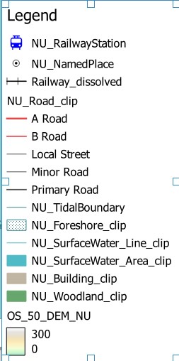
The first thing we will do is clean up the legend. By default QGIS will add all active layers to the legend. Select the
Legenditem on the top left of the Layout window (underItems), and then select theItem Propertiestab on the bottom right.First set the name of the legend as
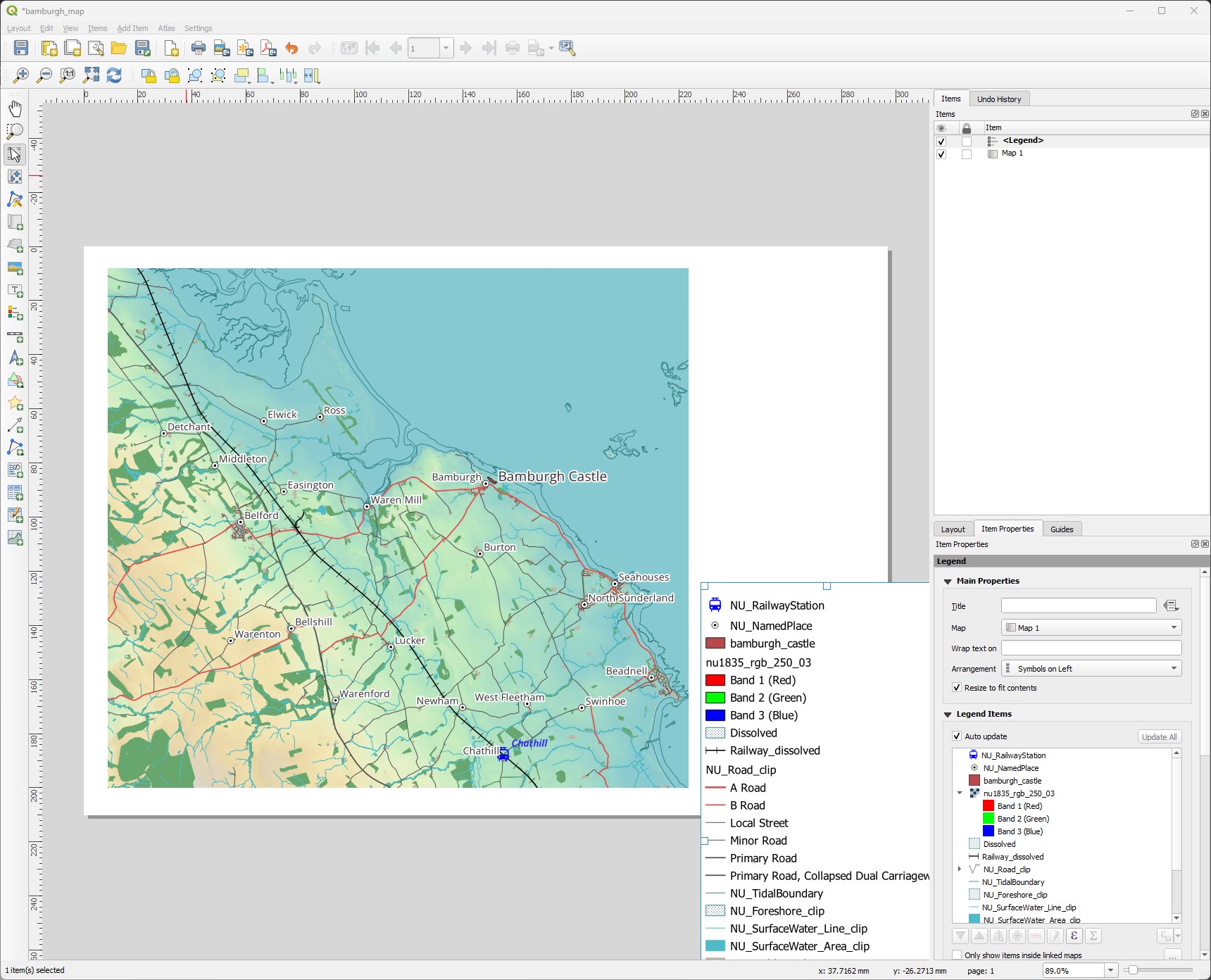
Legend(type it on the box). Then uncheck theAuto Updateoption, and start removing items by selecting them and clicking on the red ‘minus’ button at the bottom of the layer list. You want to end up with a legend like the one below (use the green ‘plus’ button to add a layer back if you remove it by mistake):
In my case, I also used the same symbology for
Primary RoadandPrimary Road Collapsed Dual Carriageway, so no need to have both in the legend. Again, I can expand theNU_Road_cliplayer on the legend layer list, select only thePrimary Road Collapsed Dual Carriagewayitem and remove it with the red minus button.For the
OS_50_DEM_NUlayer, we don’t need theBand 1(Grey)sub-name, so remove it as well. The legend should now be looking like this:
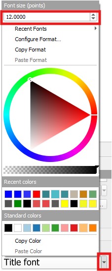
- This legend is occupying a lot of space in our map. Scroll down past the layer list on the legend
Item Properties, until you find the optionFonts and Text Formatting. Expand it by clicking on the arrow, and then reduce the font sizes of the several options by 4 points. To do that, click on the down-arrow to the right of eachFontbox, and change the font size at the top of the menu.
- The spacing between items seems to be excessive now, so find the
Spacingoption for the Legend item and reduce all non-zero spacing by 1mm, except for theColumn Spaceoption - set that one to3. It will have an effect later.
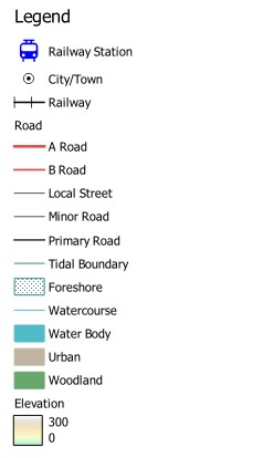
Our legend is looking much better, but there is a big problem: the item names reflect the file names, and your map readers won’t know what NU_NamedPlace means. So we should rename our layers to have intelligible names. You can rename your layers in the Map Layout by going back to the legend Item Properties and double clicking each item. But I think it is a better idea to rename the actual layers in the QGIS project. This way, if you decide to add/remove other layers to the legend, you won’t need to rename then again.
- Go back to the main QGIS window, and rename all the layers in the legend to proper, readable names. For example,
NU_RailwayStationto Railway Station,NU_NamedPlacetoCity/Town, etc. Try to use short names:
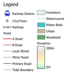
Now that we have nice and short names, we can also save space by breaking the legend into columns. Go back to the Layout editor, and on the Legend
Item Propertiesfind theColumnsoption and increaseCountto2. Your legend should now have two columns, spaced 3mm (remember theColumn Spaceoption you set a few steps above?)The extra space gives us the chance to expand our elevation bar a bit. Go back to the list of legend layers in the Legend
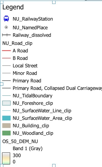
Item Properties, and double click on theElevationcolour bar. Leave theWidthasdefault, and set the height to20. Also addmas theSuffixso we have clearly labelled units. Your final legend should now look like this:
- Save your layout.
8.4.2 Adding a scale bar
Every proper map needs a scale bar. Luckily, since all data in QGIS is georeferenced, the Map Layout editor can automatically calculate the correct size for indicating scaled distances in our map.
- Go to the menu
Add Item > Add Scale Bar, or click theAdd Scale Barbutton ( ), and drag a box to add a scale to the top left of the map area, over the ‘ocean’.
We want to make sure the cartographic elements do not cover information on the map. Because we have a large plain ocean area in this map, which is not of much interest, it is OK to add the scale bar there. But if the map had relevant info throughout, it would be better to place the scale outside the map area.
- Repeat this process and add a second scale bar below the first. Then select one of the scale bars on the
Itemslist, and then on itsItem Propertieschange the units fromKilometerstoMiles. We now made our map accessible to bothcivilized and barbarian peoplemetric and imperial thinkers.
Feel free to play with the Style, Segments and other Item Properties of your scale bars to tailor them to your taste.
- Save your layout.
8.4.3 Adding a Graticule
The graticule (coordinate grid) is another essential cartographic element - without it our map is not showing proper spatial information. A good graticule facilitates navigation without obscuring the map elements. Let us add a graticule to our map:
On the
Itemslist, select theMap 1object. That is your main map frame. Go to itsItem Propertiesand find theGridsoption. Expand it and click on the green plus button to create a new graticule, which will show up below it asGrid 1.Select
Grid 1and click onModify Grid. A new set of options will appear:
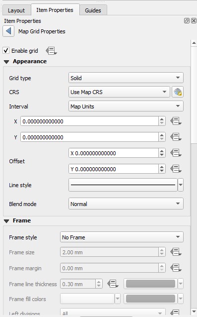
We will set several options here to have a nice grid. First, we need to decide our
Intervalin theXandYdirections. This is the spacing between coordinate lines. We are using the OSGB CRS (EPSG:27700) with metric coordinates, so this interval will be in meters. Let us add coordinates every 5km by changing bothXandYspacing to5000. You should now see a grid of lines in the map.The squares formed by the lines seem a bit ‘offset’ in relation to the map area. We can shift them so they are nicely centred in the vertical and horizontal direction by adding
XandYoffsets. On my map, anXoffset of500and aYoffset of-1500centres the grid nicely. You may need to use different values depending on your choice of framing.I now have coordinate lines, but they have no coordinate numbers, thus so far my grid is useless. Next set the
Frame Styleoption toExterior Ticks, then keep scrolling down until you reach theDraw Coordinatesoption. Check the box and coordinate numbers will appear at each line. But they do not align well with the frame, and also have useless decimal places.Our coordinates also have no axis indication, so change the
Formatoption fromDecimaltoDecimal with Suffix. That will add the easting (E) and Northing(N) indicators.Below
Draw Coordinates, you see sets of options labelledLeft,Right,TopandBottom. Change the third option forLeftfromHorizontaltoVertical Ascending, and forRighttoVertical Descending. Then at the bottom of theDraw Coordinatessection, setCoordinate Precisionto0to remove the decimal places.If we expected our map users to navigate using a compass, the actual grid lines would be useful. But since this is unlikely, the actual black grid lines are too obtrusive. Go back to the top of the
Map Grid Properties, and change theGrid TypefromSolidtoFrame and Annotations Only.Finally, let us add a black border to our map for aesthetic purposes. Go back to the main
Item PropertiesforMap 1, and find theFrameoption. Enable the checkbox to add a frame. Save your layout.
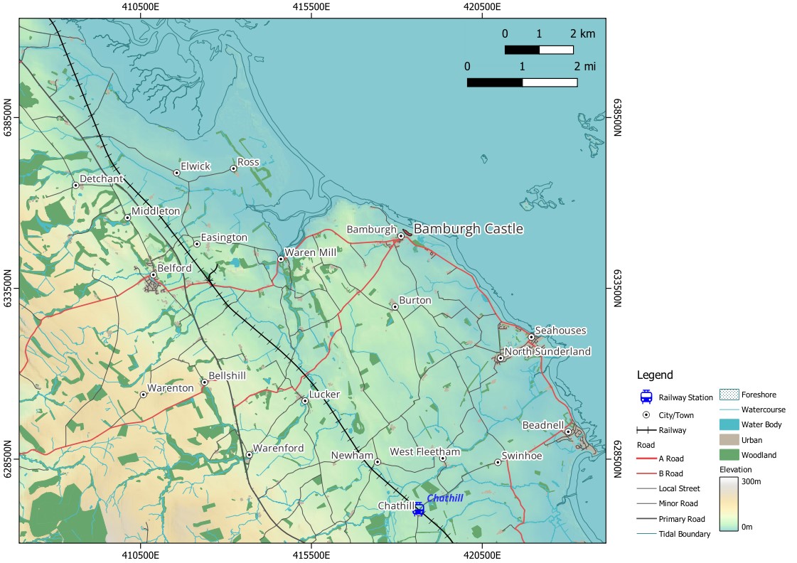
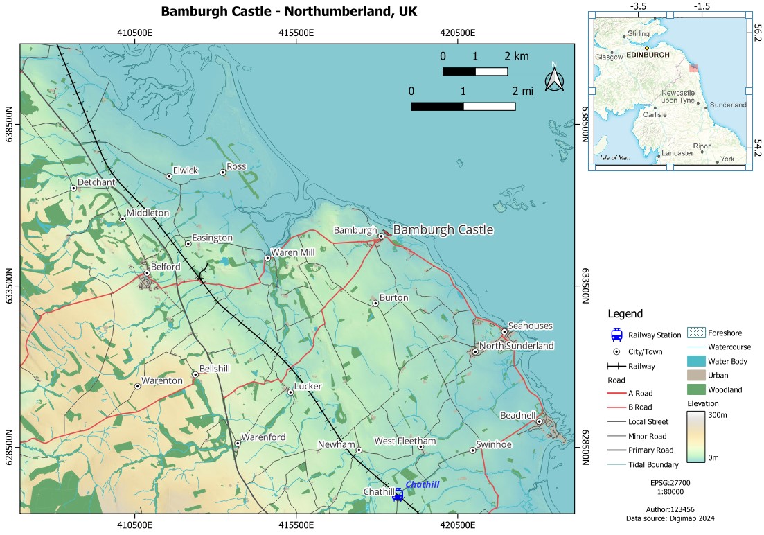
My map layout is now looking like this:
8.4.4 Adding a North Arrow
A North Arrow is only strictly necessary if your longitude grid lines are not parallel, but we will add one so you know how (and make sure you show us you’ve learned how on the assessment!).
Go to the menu
Add Item > Add North Arrowor click on theAdd North Arrowbutton (can you spot it?), and drag the mouse where you want your North arrow to be. It is by convention usually placed on the top left corner, so I’ll move the scale bars a little to the left and then place my arrow there.If you select the
North Arrowitem and go to itsItem Propertiesyou will see there are many SVG symbols for north arrows, in thearrowsandwind rosesfolders. Pick any one you like. Save your layout.
8.5 Guided Exercise 4 - Adding map annotations
Annotations help our readers understand the map. The main piece of annotation any standalone map should have is a title (you can omit the title if your map is a figure in a document, where there will be an explanatory caption under it). We also want to add some information such as data sources, map author, the CRS used and the map scale.
- Add an annotation frame under the map legend using
Add Item > Add Labelor theAdd Labelbutton ( ). On the
 Item Propertiesfor your new label, you will see a text box sayingLorem Ipsum. These are two words in Latin from a text passage that has historically been used by designers to indicate placeholder text (see lorem ipsum). Replace theLorem Ipsumby the following text, including the line breaks and line spaces:
EPSG:27700
1:80000
Author: (your student number)
Data source: Digimap 2024
Under the text box, select
CenterforHorizontal Alignment, and set font size to8. Then move your legend up until you can fit this annotation under it.Now add a Map title, using the same Text Label tool, such as
Bamburgh Castle - Northumberland, UK. You may want to resize your main map frame a bit to make room for the title above it. Set it toboldand font size14.
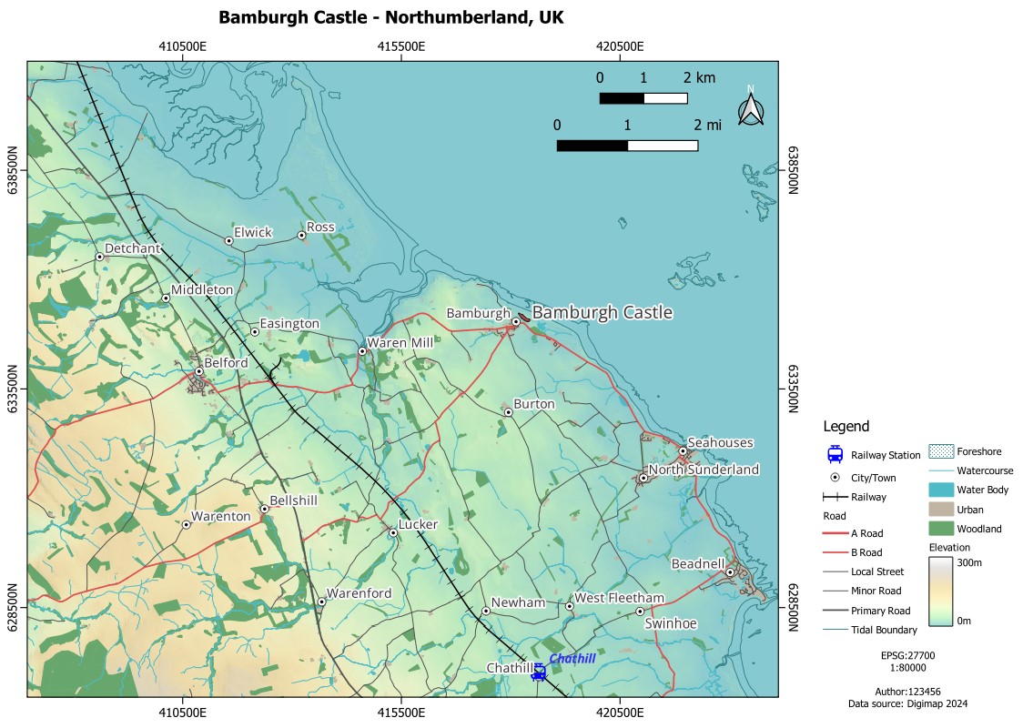
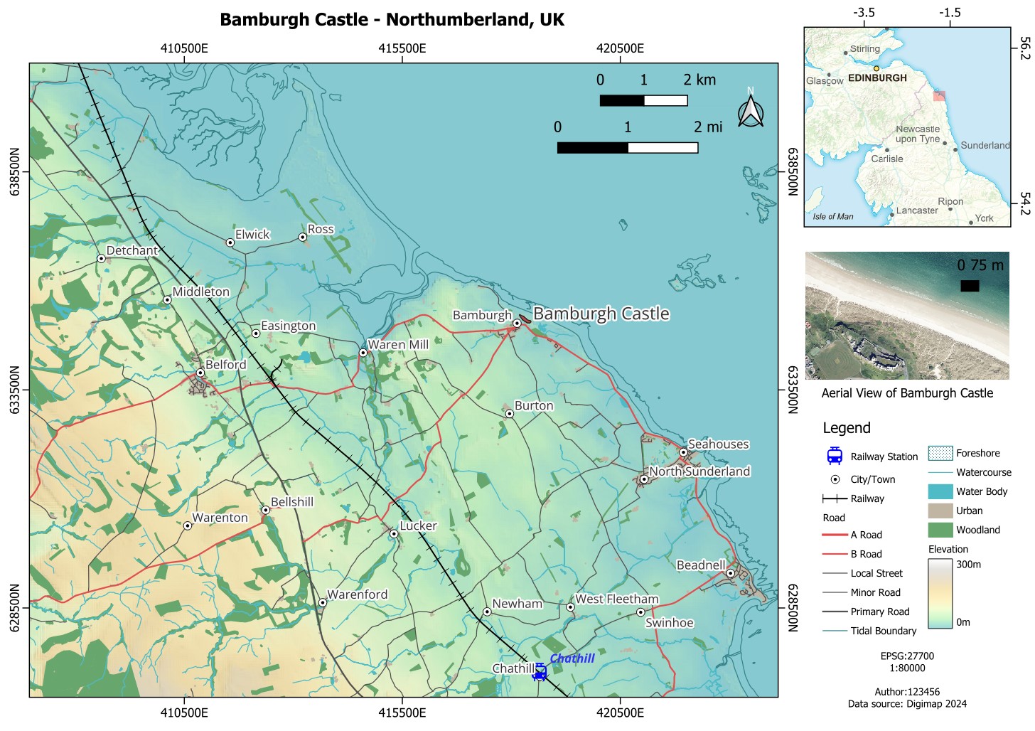
My map now looks like this:
- Save your layout.
8.6 Guided Exercise 5 - Adding map insets
A common element of maps that aids map use is the inclusion of map insets, ‘sub maps’ that show either a portion of the main map in higher detail or the location of the main map on a broader scale map. We will add both to our design
- Insert a new map area on the top left corner of your layout using the
Add Map( ) button. It will by default be named as
 Map 2on theItemslist:
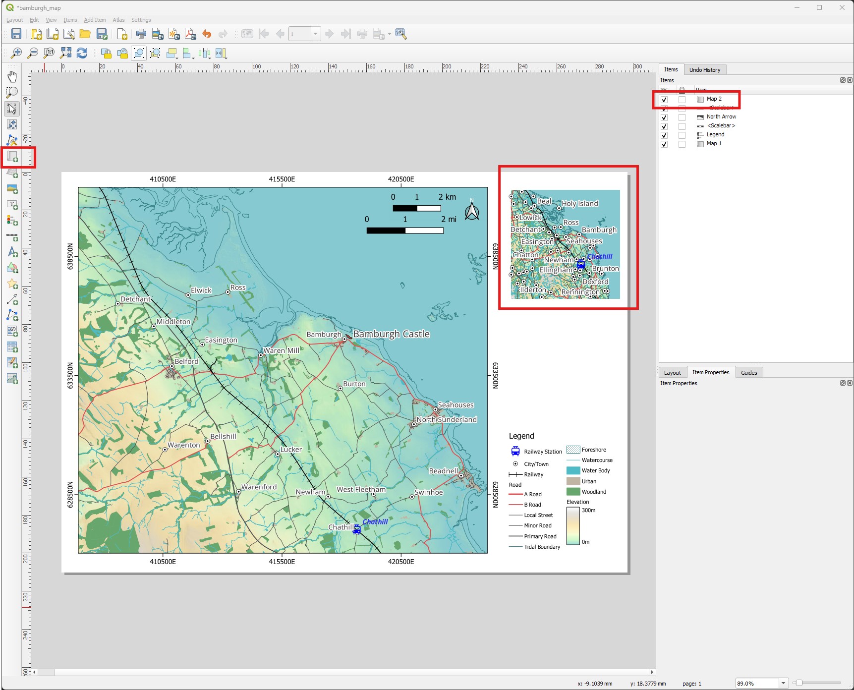
- Before we move forward, let us rename our map items to make our work easier. Double-click on
Map 1in theItemslist and rename it toMain Map, then double-click onMap 2and rename it toOverview Map. Save your layout.
For now our overview map shows the exact same content as the main map - the maps are by default tied to the QGIS main window. To be able to show separate maps, we need to associate each map with a QGIS theme. We will do this now.
First, go back to the main QGIS window, and add the
GB_Overview_Plus.tiffile to your layers. Turn its visibility off.Now make sure all (and only) the layers you want to be visible on the main map are on, and the others are off. Then click on the small ‘eye’ button on the top of the
Layerspanel, and click onAdd Theme. Name your themeMain Map.Now turn off all layers except the GB Overview Layer, and repeat the steps above to create an
Overviewtheme.Click again on the ‘eye’ button and select the
Main Maptheme. It will revert to the selection of layers you had turned on when you created the theme. Themes are a useful way to have shortcuts to different sets of visible layers.
If you need to change an existing theme, activate/deactivate the layers you want, and then click on the eye button and select Replace Theme.
Now go back to the Layout Editor window, and select the
Main Mapitem. On itsItem Properties, find theLayersoption and enable theFollow Map Themeoption, picking theMain Maptheme. Then do the same with theOverview Map, and set it to theOverviewtheme.Set the scale of the overview map (on its
Item Properties) to 5000000 (five million), and use theMove item content( ) tool so that Newcastle is about centred on the map. This map has ‘painted-on’ labels, so make sure you don’t cut off any labels when placing your map.
Now we need to indicate ‘where’ in the overview map is the main map located. QGIS has a nice feature to do that for us automatically:
- Go to the
Item Optionsof theOverview Mapand find theOverviewsoption. Expand it and click on the green plus symbol to add an overview. Select the newly createdOverview 1, and on theMap Frameoption below it, selectMain Map. You should now see a transparent pink box indicating the location and coverage of the Main Map on the Overview map inset.
The map should now look like this:
8.7 Independent Exercise 1 - Adding a second coordinate grid and a second inset map
- Now add a coordinate grid to the Overview map. following the same steps as you did for the main map, but with the following changes:
Instead of the OSGB CRS, use WGS84 as the CRS, so that the coordinates are in degrees (to determine ‘where in the world’ somewhere is, degrees make more sense than meters). To do that, manually pick
EPSG:4326as theCRSon theMap Grid Propertiesof the new grid.Use
Frame and Annotations Onlyas for the Main Map, but this time we want coordinates and ticks just on the top and right of the map. So under theFrameoptions uncheck theBottom sideandLeft sideboxes, and on theDraw Coordinatessection, change the first option ofBottomandLeftfromShow alltoDisabled.Make the font size
8, make the coordinates on the rightVertical Descending, and get rid of the unnecessary decimal places (i.e. the zeroes).Set the Overview map
Frameoption to on.
The final Overview map should look like this:
- Now add a second inset map showing the aerial photo view of the castle. Follow the steps used for the Overview map, with the following changes:
Create a third theme on QGIS, where only the air photo is visible, and name it
Close Up.Add a new map frame in the space left between the Overview map and the Legend, rename it from
Map 3toClose Up, and set it to follow theClose Uptheme.Adjust this inset map scale to show all of the castle as close up as possible. Around 15000 should work well.
Do not add a coordinate grid to this map inset, but do add a Scale Bar. To make the scale relative to the
Close Up map, create the scale bar then go to itsItem Properties, and on the first option calledMap, make sure it is set toClose Up Map. Make the scale only one segment long, and place it within the close up image.Add a small text below the Close Up Map, saying
Aerial View of Bamburgh Castle.
Your final map should look like this:
8.8 Independent Exercise 2 - Exporting your map
Your map is done! Now all is left is to export it. Your main choices are to export it as an image (to add it in a report or similar), or as a PDF if you want the map to be a standalone file.
To export as an image, on the Layout Editor window go to
Layout > Export as Image.... Pick a folder and file name to save it, and then it will show you some options. You can normally use the default options, or check theCrop to Contentbox if you want your image edges to cover only the content of the map (i.e. no white margins).To export as a PDF, go to
Layout > Export as PDF.... Pick a folder and file name to save it, and then it will show you some options as well. The defaults are fine for most cases.
Well done! You havemade a very complex and (arguably) nice looking map! You are now ready to take on the first module Assessment, and make a beautiful map showing the not-so-beautiful issue of deforestation in the Amazon.